LILAC Museum Ship
information architecture, domain model, site map, wireframe

Context
Goal: Design the information architecture, based on research, for a website for the LILAC. (The LILAC is the last steam-powered lighthouse tender in America, and now in her second life she serves as a museum during the summer.)
Outcome: The information architecture for a museum website and artifacts to communicate the design.
My role:
- Conducted domain interviews and competitive analysis for generative research
- Created domain model, site map, user journey map, and lo-fi (and hi-fi) wireframes to illustrate design
- Conducted qualitative user testing to evaluate design and identify improvements
The Process
LILAC's current lightweight website does not capture the full breadth of knowledge onboard nor provide much room to explore, so my focus for this project was to boost discoverability while supporting visit planning. Research was conducted into museum and visitor priorities before reimagining her website.
I concentrated on researching museums as a concept since I was already familiar with the particulars of LILAC as a former volunteer. Unstructured interviews were conducted with a museum educator and two self-professed regular museum-goers to gain their understanding on museum visitors, i.e. my users, and their conception of the function of museums, with an emphasis on historical museums.

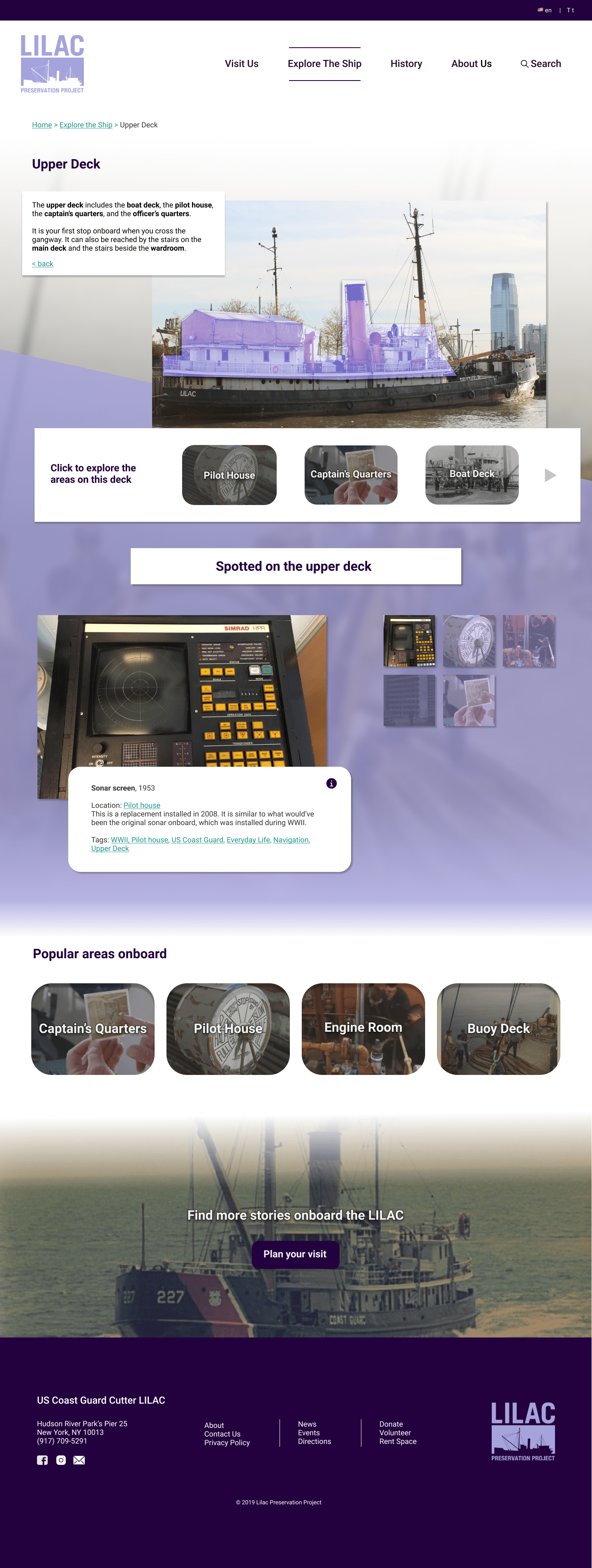
A key finding showed that despite the copious content that museums provide, visitors often browse and look at only what catches their eye. Visitors check whether topics that they already have an interest in are present, and then from there discover other topics of interest. Exploration, already important for a museum like the LILAC that is rooted in its physical space, became the underlying theme for my website design.

After producing a domain map, I used this to create a site map of the content pages and to explore different options for the nav. The Museum of the Home, Imperial War Museum, and the Metropolitan Museum of Art were also referenced in organizing visit and administrative information structure.

In particular, I would like to highlight:
- A card sort was conducted to test the use of nautical terminology. Labeling was a major challenge! I had to balance understanding the labels versus educating the user.
- A tree-test was conducted to inform the site hierarchy and groupings. It was particularly helpful for organizing the About Us pages.
- Cross-links are a big component of site navigation but as they are too messy to include on the sitemap, they are omitted here.

Design
I started designing from the lowest-level content page upwards. Since a museum’s site “mainly acts as 'brochure' ... which primarily is supposed to attract people to visiting the 'physical' museum” (according to Van Welie), the site content only highlights potential topics of interest and provides visit information.


As the focus was on information architecture, the scope of the project ended at lo-fi wireframes but I built hi-fi wireframes afterwards to see how the designs might actually look. Turns out... there was something to be desired about their visuals, so I tried again.


Evaluating
User testing involved moderated thinkalouds using the lo-fi wireframes, with both findability and discoverability task scenarios, and targeted questions about the geographic content page and artifact listings. (Again, the hi-fi wireframes shown here were created after the user testing.) Three user evaluations occurred: two tests were conducted in person and one was conducted remotely.
Participants were:
- habitual museum visitors
- had a basic knowledge of American history
- had little knowledge about ships
Users displayed a willingness to browse, sometimes in spite of their uncertainty around certain labels. Task order was rearranged per participant to account for potential learnings during the task. The tests showed that more consideration was needed around labeling and particularly around the artifacts section, and prompted reformatting the layout and revising the site copy. However, since these tests were done using lo-fi wireframes, future evaluations using hi-fi wireframes would have produced more trustworthy data, due to the fact that participants sometimes find lo-fi wireframes difficult to visualize.
The evaluations also captured successes—the timeline classification within the History page was very suitable for someone looking for a particular event or time period (something I had worried about), and participants also interacted with related links within the narrative content page and the thumbnails for exploring the Upper Deck without any prompting, so the underlying goal of exploration was met.